Building a Blog
- 12 May 2016
- ByMichael Croxton
- 6 min read
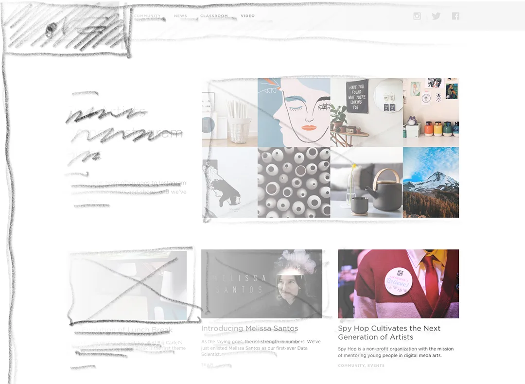
Here’s a look at how we completely redesigned this site, transforming it from a typical blog to a publication for anyone interested in running a creative business.
Understand your goals
Before designing anything we asked ourselves what we wanted to get from our blog. Who was it for? How could it better serve our readers?
We knew we wanted it to be more than a blog. We wanted it to be a hub for all things creative. Interviews with makers, behind the scenes looks at artists studios, and tips for running a creative business.
We also spent time figuring out how we wanted readers to use the site. Everything from giving them access to related content, to making it easy to share articles on social media, as well as designing articles that were both legible and easy to skim.
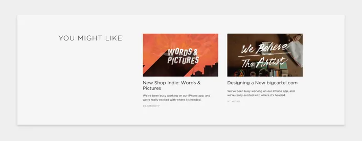
Article recommendations
This foundational understanding of what we were trying to accomplish allowed for quicker communication and guide posts for us to design within. We spent a lot less time exploring vague ideas and a lot more time iterating on very specific things. There were far fewer meetings trying to "fix" designs because we were all on the same page.
Give yourself limitations
The team started with a set of requirements - things we knew the blog needed to do functionally, visually, and technically. We knew that we were going to have limited amounts of developer time (they were only able to work during weeks that they were helping our amazing Support team).
This proved to be a great set of limitations for us. We made decisions quickly, iterated through a variety of options and, for launch, had a product that was functional and beautiful.
We kept our focus on content, keeping the navigation as simple as possible, and designing patterns and styles that could be used and re-used.
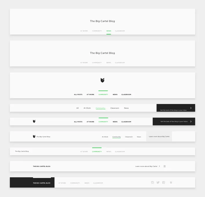
Explorations for the navigation
To save design and prototyping time we first looked at a ton of different sites for inspiration. From simple, easy to navigate sites, like Medium, to more expressive, freeform sites like VSCO. We landed somewhere in the middle. Taking the things that we liked and dropping the things that we didn't, and combining them into something unique to Big Cartel.
By defining our goals, the team was able to start the project with a clear and collective understanding of what we were trying to do, our plan to accomplish it and ways to know if we were successful. This saved us from a lot of misunderstandings and allowed us to work more closely as a team.
Design for content
We moved from sketches to wireframes to more polished design pretty quickly. But the biggest help was designing with actual content. Luckily we had hundreds of posts on our existing blog for us to design with.
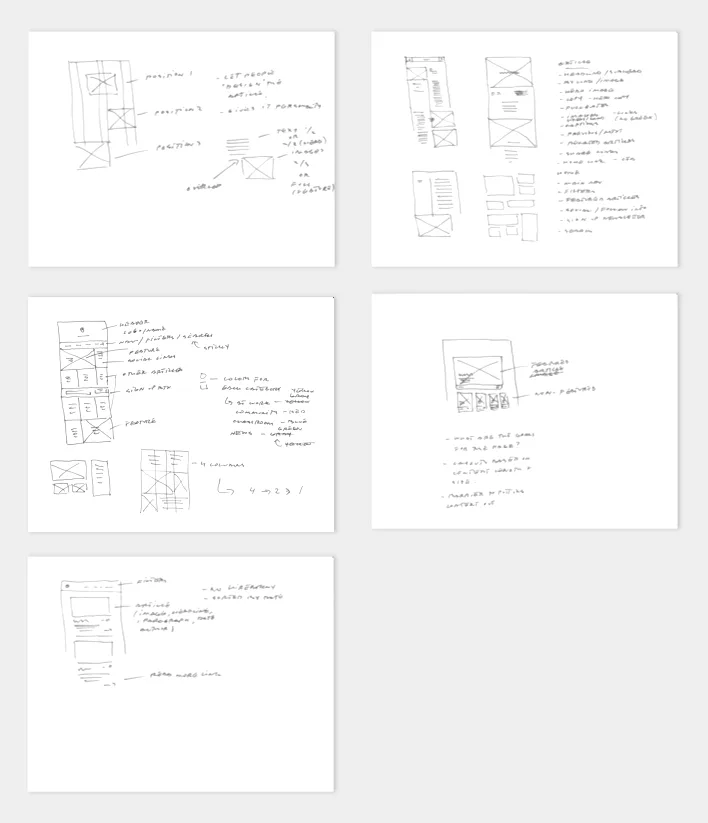
Early sketches
A lot of times when designing you use placeholder images and copy. Sometimes it's unavoidable. When you do this, you tend to have to cross your fingers that the design will work when you start adding content. Often when the real content gets put in, your design breaks and reveals a bunch of problems that you couldn't foresee.
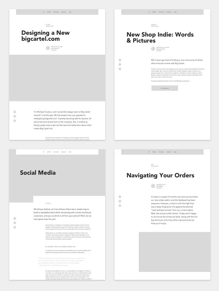
Article detail wireframes
When you’re designing with the real work, you’re able to make informed decisions instead of making so many assumptions. When content dictates the design, and not the other way around, design decisions become clearer and the end product will be more honest and engaging.
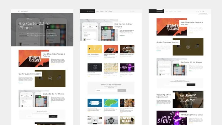
Home page explorations
Have an attitude
At Big Cartel we pride ourselves on being artists, and want everything we make to reflect that. We wanted the blog to feel unique to us, and hopefully you can see evidence of that. From the use of bold headlines and large images, to the asymmetrical article layouts.
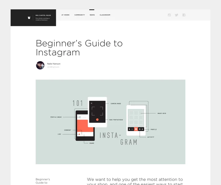
Articles feature bold headlines and beautiful images
Allowing your personality and uniqueness to come through will set you apart from the crowd and gives whatever you're working on an imbued sense of authenticity. Don't take inspiration too literally. Get the essence of it and then make it your own.
Plan for the future
We knew that we wouldn't be able to design, code, and polish every feature the blog would need before it launched. We talked through a bunch of things in the beginning that we knew we would want the site to do eventually. We then tried not to box ourselves in, or build things one way when we knew they'd have to change later.
As we built we looked for areas where we knew we didn’t have all the answers: things to test and gather data on. Knowing we'd be watching and addressing them in the future allowed us to strip down our goals and work faster and smarter.
The blog will continue to improve over time. It's a living thing, so we'll be making tweaks here and there. Adding new pieces of functionality. But most important is seeing and learning from your experiences on the blog. We hope you enjoy it.
12 May 2016
Words by:Michael Croxton
Tags
- Share