Choose the Right Design for Your Shop
- 3 February 2021
- BySarah Anderson
- 5 min read
When setting up your online store, you want to get the look just right. Of course you'll fill it with quality products, but your shop needs to look great (and be easy to use) or visitors will quickly click away.
You might have a variety of goals when you're getting started, and that's great. Maybe you want your quirky personality to shine through, or it's time to launch a professional-looking brand. When you're ready to design your shop with your business goals in mind, here are some things to consider.
Pre-flight checklist
Before you start customizing your shop, think about how you want your business to be presented.
What words would you use to describe your brand?
What colors capture that feeling?
Which fonts coordinate with your logo?
Do you already have product photos ready to use?
Try one on for size
Once you've got a clear idea of what you're working with, try a few pre-made themes or templates on for size. Don't rule anything out before some trial and error - customize each theme with your brand colors, fonts, and logo to make the design your own. What you find you like might surprise you.
Seeing them in action, you'll quickly narrow down the list to a few options that seem to fit. From there, assess how the theme will work with your strengths and where you spend your time.
If your brand is colorful and a little quirky, try a theme with more opportunities for customization. Uno+Ichi's palette is broad and fun, while still relating to the glaze colors used in their ceramics. They use the Netizen theme, but you might also be drawn to the Ranger theme's built-in accent background options.
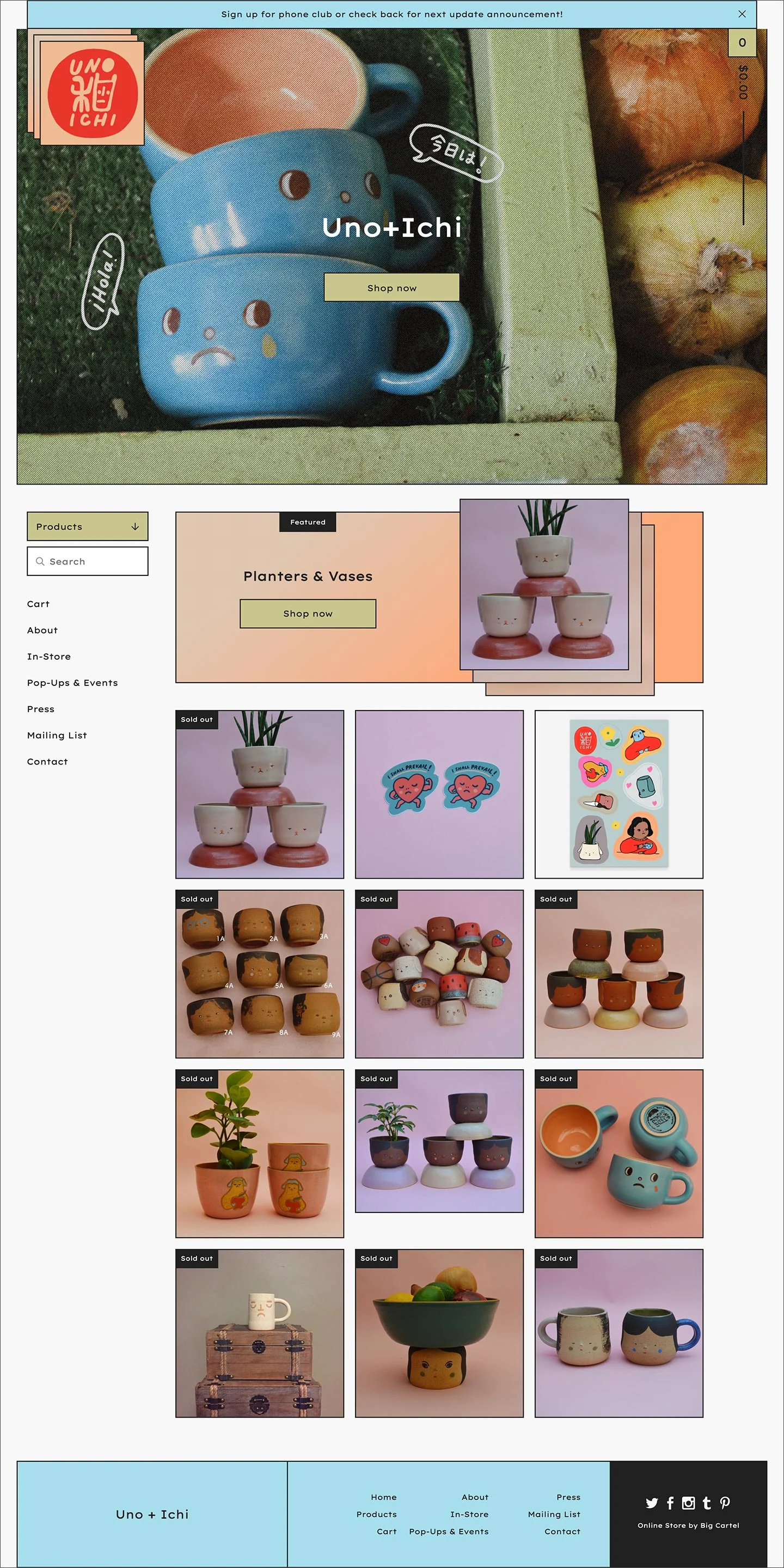
Uno+Ichi uses Big Cartel's Netizen theme
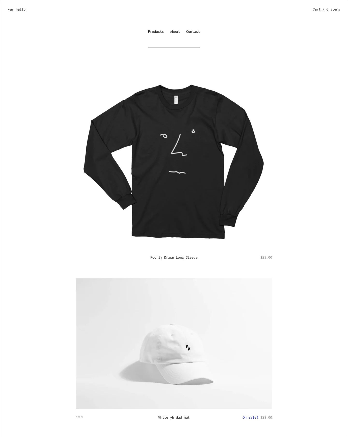
Photography not your strong suit? Use an announcement message that shows at the very top of your shop to promote shop specials. It's eye-catching without relying on imagery. Start with Roadie, Sunscreen, or Neat to try this feature out.
Want to focus on just a few core products? Look for a theme that utilizes large images and featured products on the homepage. You might also like to show off your images in a homepage slideshow like you can find on the Picklejuice and Trace themes.
Not a fan of cropping each image to the same size? A theme that purposely offsets product images or has a "masonry" layout will make the image variation look intentional. José Roda's images never feel out of place, no matter their dimensions, thanks to a consistent color palette and his choice of the Sidecar theme's masonry products page.
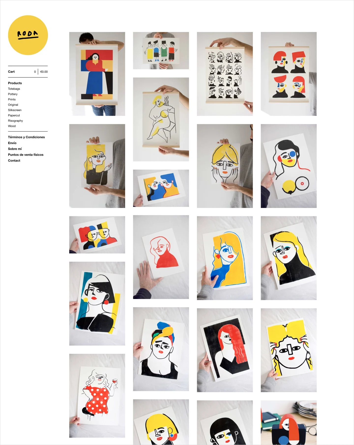
José Roda uses Big Cartel's Sidecar theme
No matter which theme you choose, remember that you can always change up the look of your shop as your business grows and evolves. Later on, you can even consider hiring a designer to make more advanced tweaks or to give you a one-of-a-kind look. But for now, the important thing is to get started - go with your gut, click save, and go on with your day.
Give it a test drive
Each time you change your shop's theme, it's smart to test it out by buying a product yourself. Better yet, ask a trusted friend to place a test order and give you some honest feedback.
Do the colors make it difficult to read important details?
How does your shop look on a mobile device?
Do your images look as crisp on desktop as they did on your phone?
What'd you like to improve during your next photoshoot or product update?
Kate Miss does a great job walking you through some branding basics in her Skillshare class, including how to pick colors and fonts that fit. Deciding on these details early on makes store setup a breeze.
It's smart to review your store periodically, ensuring that it still looks great and contains all of the information your customers need. Between awesome products and a well-maintained storefront, keep your shop fresh to delight new and returning customers. Don't be afraid to mix it up, it's gonna look great.
3 February 2021
Words by:Sarah Anderson
- Share
