Designing a New bigcartel.com
- 24 March 2015
- ByMichael Croxton
- 6 min read
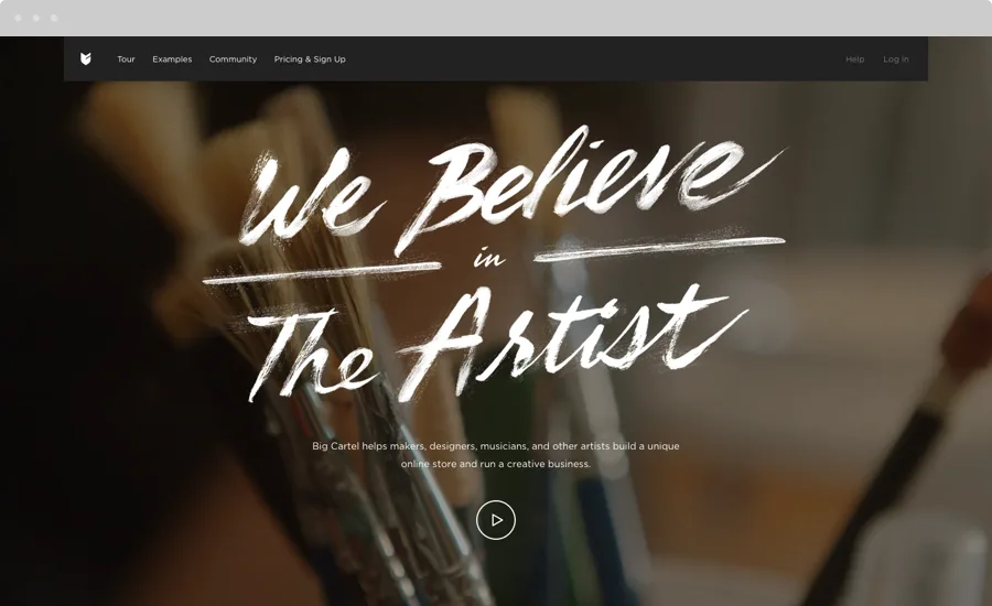
I'm Michael Croxton, and I joined the design team at Big Cartel around 7 months ago. My first project was, you guessed it, redesigning bigcartel.com. A pretty daunting task for anyone, let alone someone brand new to the company. But, it ended up being a great way to get my feet wet and really learn about what makes Big Cartel tick.
The previous site had served us well, but it felt dated. It hadn't been overhauled in close to 6 years (last time I checked, that’s about 20 years in internet time). With a 600px wide single column layout, it wasn’t very flexible and wasn’t built for our steadily growing mobile audience.
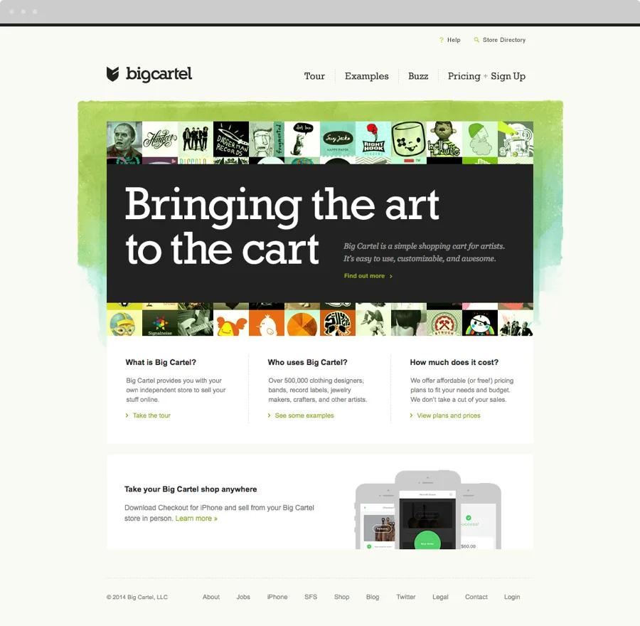
In 2013, Big Cartel introduced a new logo, affectionately called "The Fletch," as a companion to the Big Cartel word-mark. We followed that update with the first iOS app and a mobile version of the admin later that year. These were the first steps in introducing a new, clean, modern and unified design language.
Our marketing site serves a couple of purposes:
First, it’s used to introduce artists to what Big Cartel is and how it works, and to highlight artists currently using the platform.
Second, it serves as a portal into the Big Cartel platform, where artists, who currently have shops, can get help, learn new skills, and login to their store admin. And when signing up, it’s the first step in introducing them to our UI.
The challenge came in making these two aspects blend seamlessly. So we kicked off the project by setting some guiding principles and goals:
1. Simplify everything
From our visual language to how we write about things. With a platform like this there is a tendency to over-explain things, so we set out to show instead of tell.
Instead of writing about how our themes are responsive, we clearly show example stores on both desktop and mobile devices. Instead of spending 3 paragraphs talking about how simple we make it to customize your shop, we show the tools. The site feels as light and easy as the actual product.
2. Build a framework
Something that could be updated and added to. We need something that we can grow into over the next few years.
After some experimentation we ended up with a modular system that allowed for individual pages to feel unique and have the flexibility they needed to showcase their content. This allows for some variation, while the site still feels like a cohesive whole.
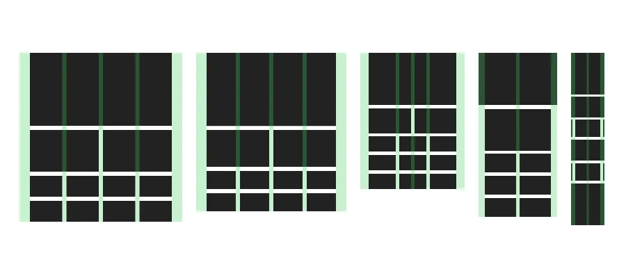
The site was in serious need of love on the mobile and touch device front. The site isn’t a traditionally responsive site, I think of it as adaptive. Certain features are brought out to feel more tappable on your iPad, for example, but it all looks as good on your laptop as it does on your phone.
3. Look and talk like Big Cartel
Surprisingly this was probably the hardest part of the project. To bring together and define how we visualize and talk about our company, into one cohesive language.
In the early stages, we tried lots of different tactics and approaches. One early concept encouraged visitors to “paint” the background of the home page. We also toyed with more asymmetrical layouts.
After rounds and rounds of exploration something started to take shape. Balancing simple, functional design, with artistic, human touches. We used big, beautiful images of products, artists, and shops, some overlaid with hand-drawn elements.
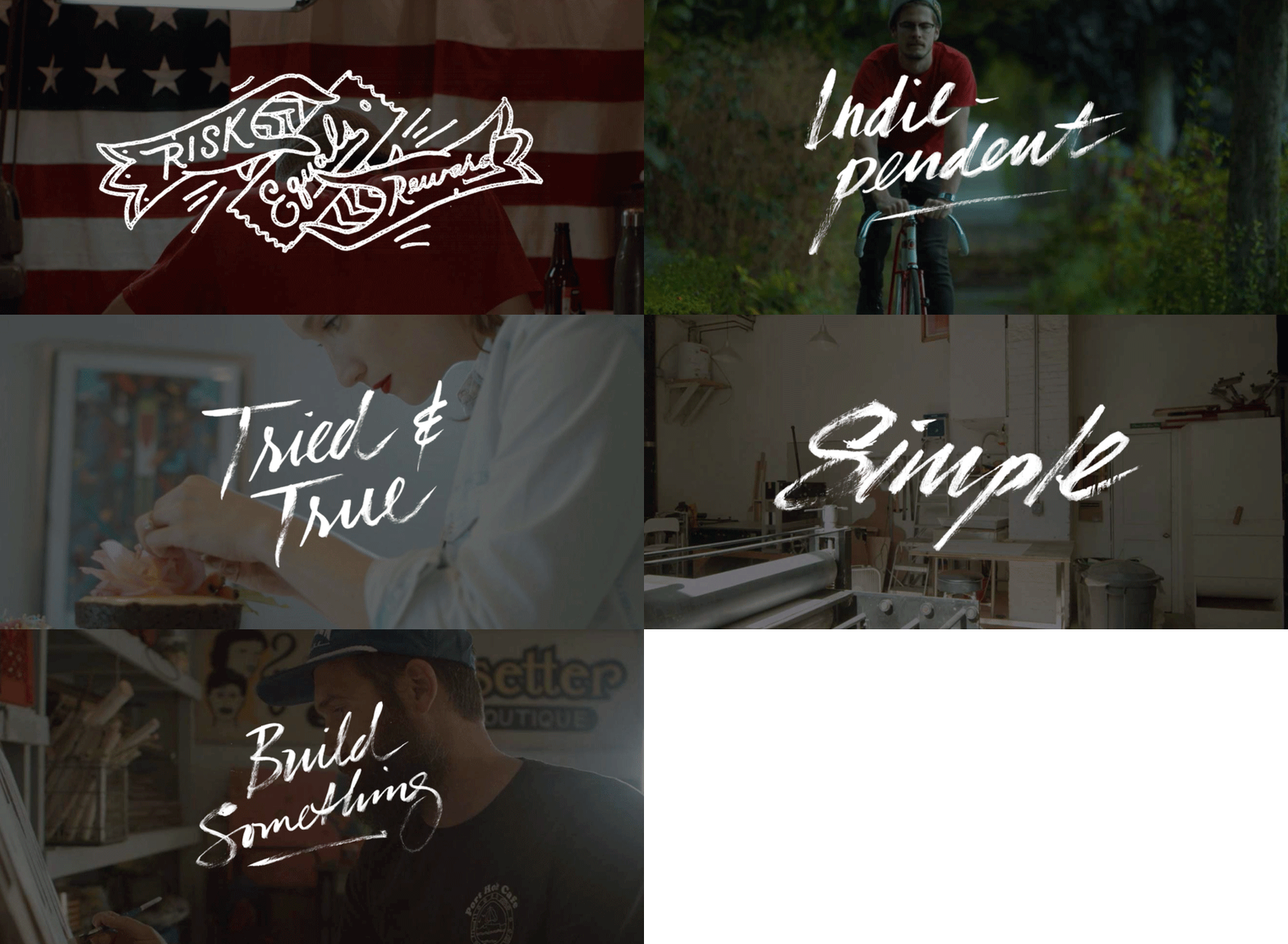
We fought to keep the site from being sales-y. We’re not right for everyone. You won’t be hit over the head with pop-ups and a barrage of Calls to Action begging you to sign up, because when it’s the right fit, our customers know it.
4. Highlight our artists
They are at the core of why we do what we do. Why we get up in the morning. We say we believe in the artist because we really do, and we work hard to live up to that statement. You can see this on almost every page of the new site. From the gorgeous new video on the Homepage, to the shops we know and love featured in the Tour, Examples, and Community pages, the “color” and “character” on the site comes from our community.
We collected and curated a list of our favorite shops, found big, beautiful images of their products and shops, and made them a central part of the site. What better way to encourage people to take a chance and open their own shop than to show people who are doing it already? A few of them share a bit of their story, along with links and other info that potential shop owners might find helpful.
These examples are easy to update, so we can keep the site looking fresh as new artists join the Big Cartel family.
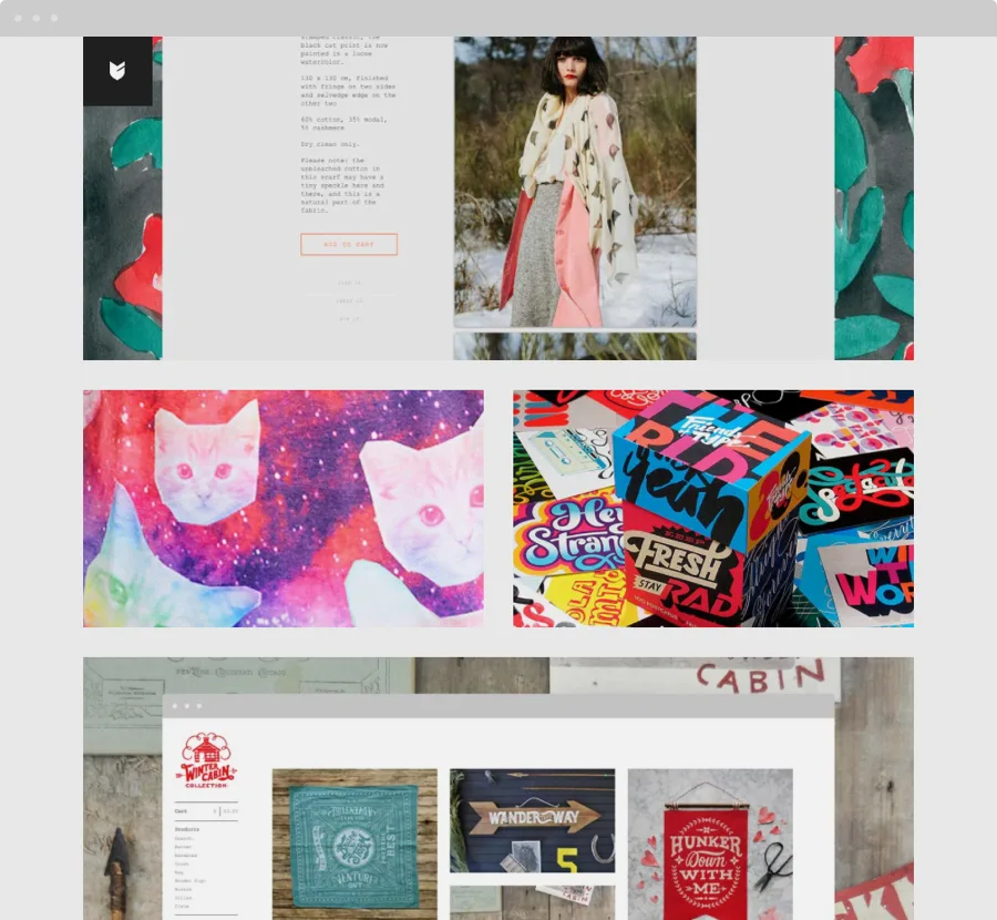
The final product isn't perfect. It's just a start. A launching point from which we can learn, and adapt, refine and build on. But I'm proud of it, and hope you like it.
24 March 2015
Words by:Michael Croxton
- Share