Five Artists Doing Product Photography Right
- 8 January 2020
- ByAndy Newman
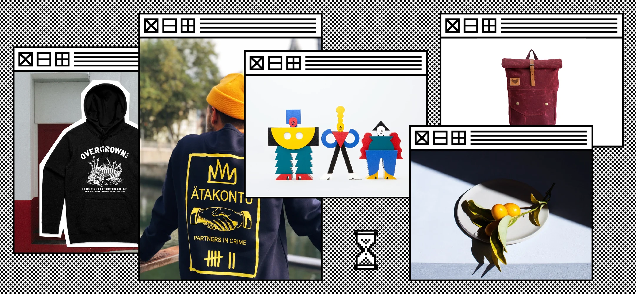
One of the best things you can do today to improve your brand is to invest in photography. Product photography, headshots, the whole nine.
Great photos help your brand stand out from faceless big box retailers, they reinforce the quality of your work on display, and can be used everywhere from your shop to marketing materials.
As much as I love some snappy copy, the facts are clear - when it comes to selling your work online, visuals impact customers more than anything else. Let this info compiled by the folks at Buffer do the talking:
Visual content gets 94% more total views than content without images or videos
Images help with information retention - studies have shown people remember 80% of what they see, but only 20% of what they read
Conversion rates (or sales) for content with custom visuals is 7x higher than they are for content without custom visuals
And Justuno reports that “93% of consumers consider visual appearance to be the key deciding factor in a purchasing decision.”
Ready to step your photo game up now? Thought so.
Here’s a look at five top notch stores that use product photography to elevate their brands. Take these tips as inspiration and mix them with the elements that make up your brand’s voice. Not every style will work for every product, so it’s still important for you to understand the story you’re telling.
Overgrown Co.
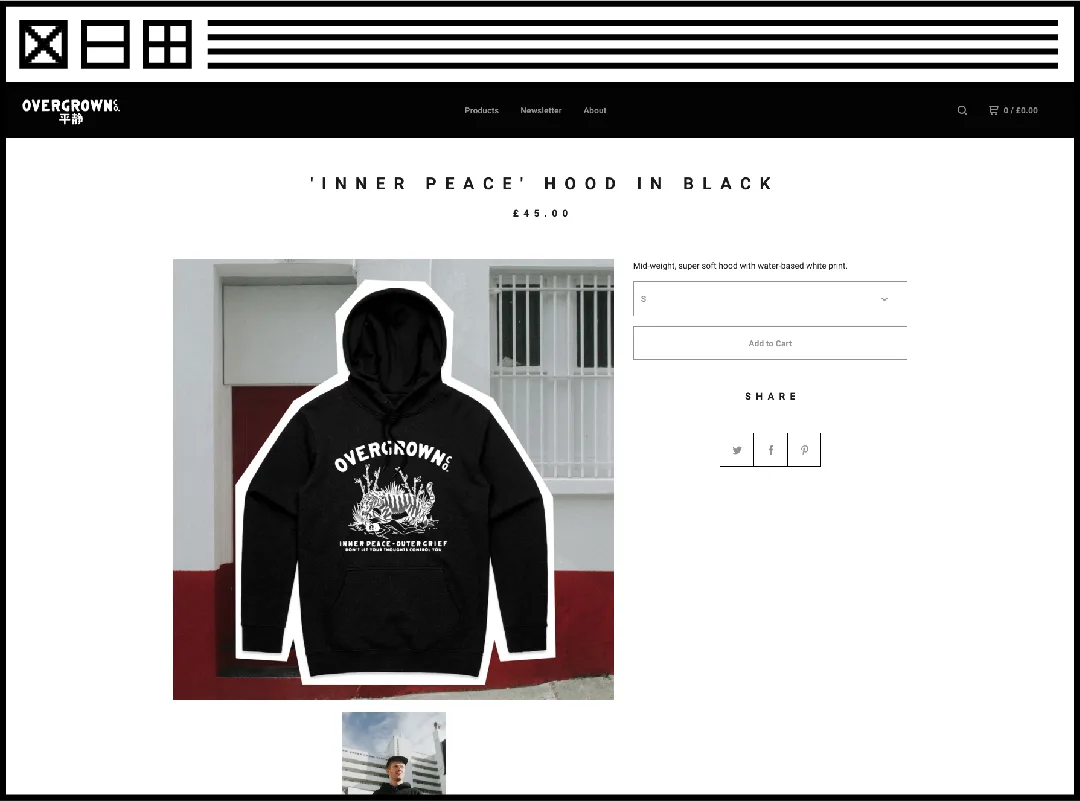
Overgrown Co. proves consistency should be your number one priority. Every aspect of their brand is clear, from the streetwear vibe to the environmental focus, because they waste no opportunity to show off what matters to them.
From one photo to the next, images are crisp and well-composed with a consistent editing style. They make sure to highlight each product on a contrasty background so their apparel pops; plus they have plenty of images to help customers picture themselves in their t-shirts and hoodies by photographing models everywhere from gritty hallways to the streets of Brighton, UK.
Atakontu
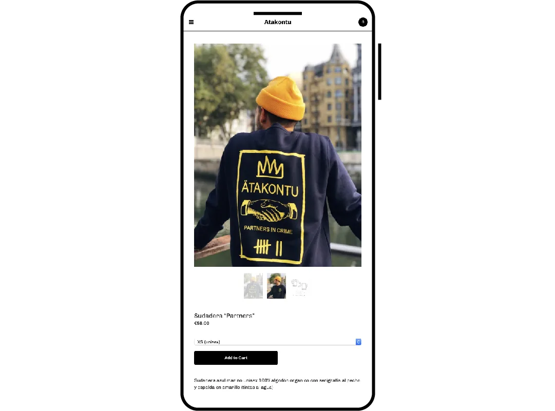
Atakontu sells the vibe right from the moment a potential buyer visits their shop. They highlight their playful, friendly designs by placing them on smiling models in nature, meaning no two images feel the same.
By using the world around them to frame their models and their apparel, they can easily emphasize (or de-emphasize) color. A green sweatshirt feels lived in on a lush background full of trees, while a black top framed by spouting water fountains makes a customer want to get out and wear their gear.
José A. Roda
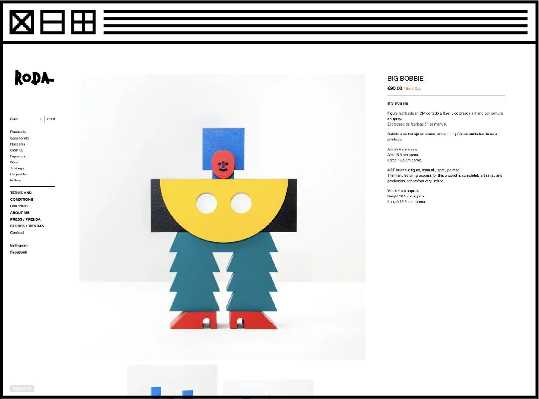
José A. Roda brings inanimate objects to life by placing his colorful artwork on stark white backgrounds. When he wants to mix it up, he’s not shy about injecting himself right into the photo. By holding his art, José gives the photos depth and a connection to the maker that is critically important when sharing work with people through their computers and phones.
Little Upside Down Cake

Each product photo from Little Upside Down Cake is the definition of technical excellence on display. The images featured in their store wouldn’t feel out of place in a high-end home goods magazine or on the wall of an art gallery. By placing their products with care, playing with shadows and textures in the frame, and adding some relevant props, the value and utility of their products couldn’t be clearer.
Blind Chic.
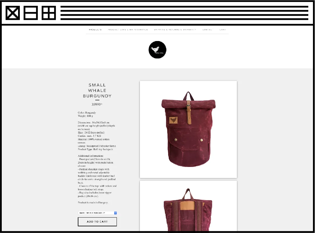
Blind Chic. proves simplicity can be effective. They start by showing their products on a clean white background with nothing else in the way. This allows shoppers to quickly scope out which product speaks to them most. Then they can select a product in their favorite color or style, only to be met with additional product photography that shows off their bags in detail to focus in on their quality and the fact that they're crafted with care. Even more stunning photography shows their bags in use out in the world, inspiring shoppers to a little adventure of their own.
In short: Consistency, consistency, consistency. I keep coming back to that word because it matters a whole lot! Having a shop that features dozens of images all complemening each other shows you care. While it might be subtle, those consistent touches are part of what sells the value of your brand.
Photography is a piece of a larger puzzle, so while it’s not the only thing that matters, it is often the first thing people see and process when it comes to what you’re selling. A shopper might not know (or care) how much time or money you spent on your photos, but if they can’t clearly see the product and picture themselves using or wearing it, they won’t buy it.
Here are a few resources to take inspiration from the shops above and create your own great images:
Want to get on our radar? Follow us on Instagram, tag your posts with #shopindie, and we’ll keep an eye out for you.
8 January 2020
Words by:Andy Newman
- Share
