Foundry in Action
- 21 July 2016
- BySarah Anderson
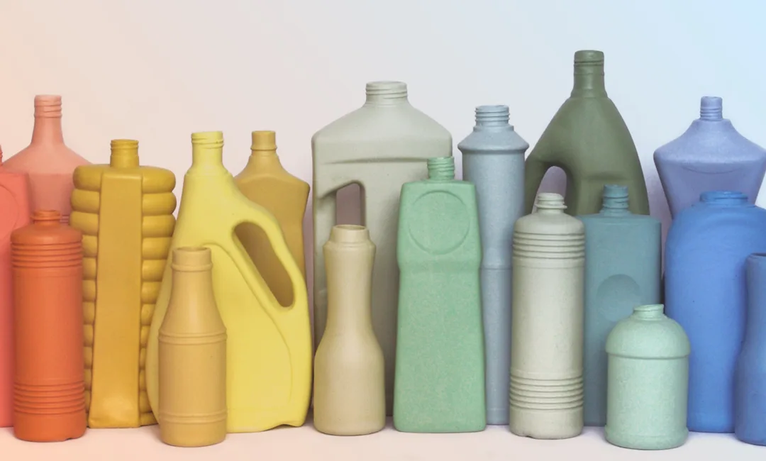
With the Foundry theme, your homepage is more customizable than ever.
There's an optional welcome image, featured categories or featured products (or both), and plenty of opportunities to customize colors to encourage shop owners to really take charge of the look of their store. We've seen some great-looking takes on this theme, and now we're sharing a few favorites.
Foekje Fleur
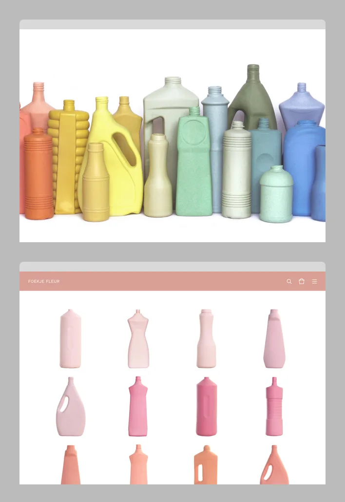
On the surface Foekje Fleur's designs look playful, but they also address serious topics like environmental pollution. This artist stocks her shop with a rainbow of vases in the forms of discarded plastic containers. The header, footer, and primary text highlight some of these bright colors, while the Welcome Image gives a glimpse of what the shop holds, without any distractions.
Strictly Cassette
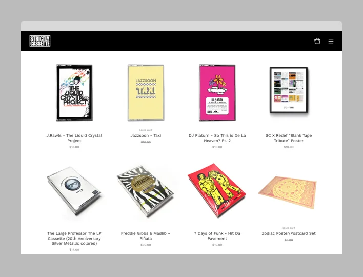
With exclusive and limited edition releases, Strictly Cassette is embracing the simplicity and nostalgia of the cassette tape. The beauty of their store is that it's all about their unusual, tactile product, so they don't need a flashy storefront. Clean photography against a white backdrop blends seamlessly into the store's white background. Combine that with a black header and sans-serif font and it gives the shop a perfect throwback feel.
2 dots over the i
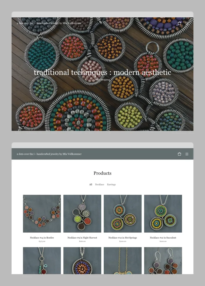
Based in Salt Lake City, jewelry maker Mïa Vollkommer is inspired by traditional wirework and bead weaving. Her colorful jewelry stands out in a shop that proves that white and gray don't have to boring. Her shop's header is a sort of blue-green-gray that works well with the warmth of her product photography. The close-up Welcome Image and Welcome Text draw shoppers into her store by giving them a good idea of what they'll find inside.
Love Objects
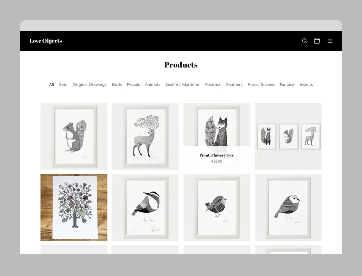
Artist Justin Landon is based in Germany, where he creates intricate ink illustrations inspired by nature. For his online print shop, he doesn't utilize the Welcome Image, because his shop is already set up like a gallery wall. His consistent image sizes and photography style really let the products shine, and his pen and ink style is well suited to a store using varying shades of black, white, and gray.
It's always a good time to take a look at your shop's homepage, and experience it like a customer. Are you seeing some great products? Do you get a feel for the range of available products? Do the store's colors and fonts fit with your brand? If you determine that your store could use an update, give Foundry a try. It's waiting in your admin.
21 July 2016
Words by:Sarah Anderson
Tags
- Share