Lunch Break in Action
- 13 April 2016
- BySarah Anderson
- 3 mins. read

Lunch Break is a really versatile theme that gives you tons of control over the look and feel of your shop, and we hope you love it as much as we do.
We're thrilled to see so many shops using Lunch Break already, and a few sites have caught our eye. We took a closer look at three of our favorites, detailing their settings and what we think makes them great. Grab some inspiration below, then head to your admin to try Lunch Break for your store.

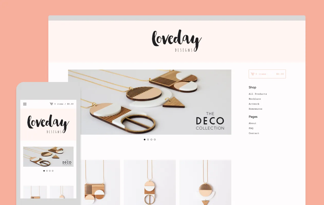
You don't have to use a white background to have a clean-looking shop. Loveday Designs uses the palest pink background to echo the more vibrant blush-colored header. The shop feels cohesive and warm, but never like someone spilled Pepto Bismol on the page.
Background Color:
Header & Footer Background Color:
Button Color:
Primary Font:
Secondary Font:
Sidebar Position:
Header Alignment:
Products Per Row:
One more tip: Owners Lauren and Kate Cooper carefully edited images so that the shop feels consistent. Try keeping your product photos at a similar scale, so that customers get a sense of size or fit, just by browsing items.

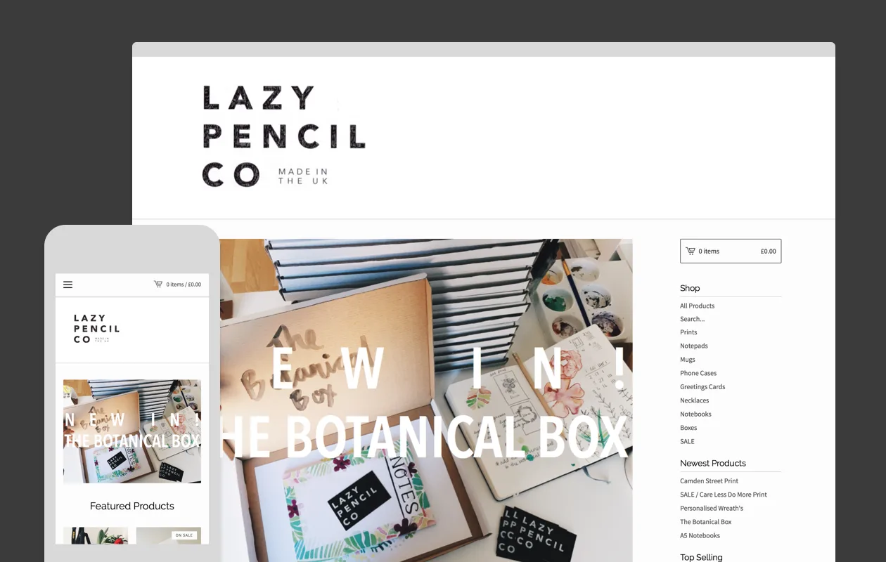
When setting up shop, a centered logo is a straightforward choice. But Lazy Pencil Company thoughtfully considered their left-justified logo, and lined it up with the left side of the page. The result feels grounded and fits with the store's branding.
Background Color:
Header & Footer Background Color:
Button Color:
Primary Font:
Secondary Font:
Sidebar Position:
Header Alignment:
Products Per Row:
One more tip: When you have a wide variety of products, increase your number of products per row. Owner Hannah Venables shows her range of prints, phone cases, cards, and more by displaying 4 products per row.
###Gina Marris

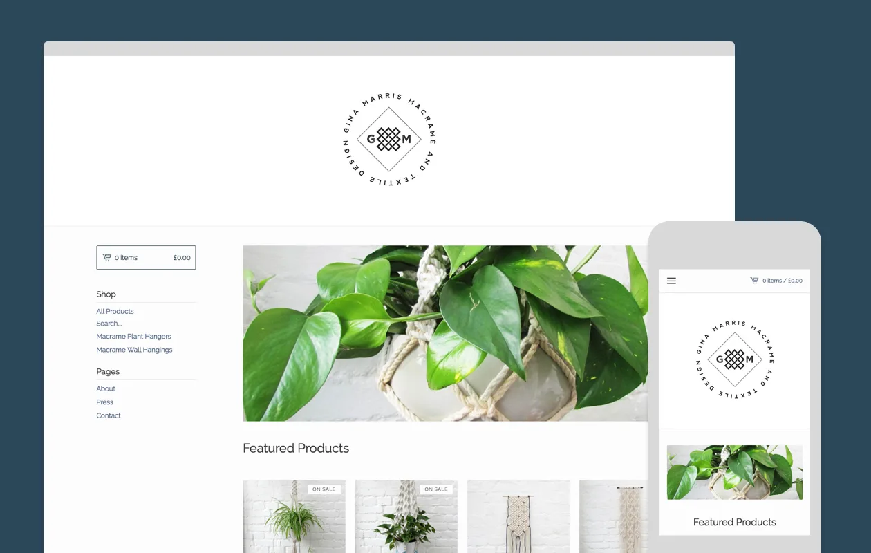
When choosing your shop's colors, think about your products and photography. Gina Marris fills her store with macramé in white and cream, with a few hints of color. This color palette extends to the shop design, and the result is calm and cohesive.
Background Color:
Header & Footer Background Color:
Button Color:
Primary Font:
Secondary Font:
Sidebar Position:
Header Alignment:
Products Per Row:
One last tip: Crop all of your slideshow images to the same size. The images will cycle seamlessly, and customers will be able to easily find the forward and back arrows if they want to take a second look.
One of our most versatile themes yet, Lunch Break gives you a ton of control without sacrificing usability. Take the time to try out all of the theme's settings until you find the right combination for your shop. Want to give it a shot? Lunch Break is ready and waiting in your admin.
13 April 2016
Words by:Sarah Anderson
Tags
- Share