Make the Foundry Theme Your Own
- 11 July 2016
- ByNate Hanson
- 2 min read

With just a few tweaks to the Foundry theme, you can get a look that's totally your own. Here's how we mixed things up to give a fresh look to the store design in just a few minutes.

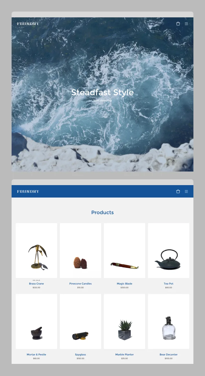
This blue and gray color palette, paired with a welcome image straight from the coast, gives the store an instant sense of location. Think about how design details can support your shop's story to develop a cohesive brand.
Background: #FFEFE3
Welcome Image Overlay Color: #155399
Header & Button Background: #155399
Primary Text Color: #155399, Secondary Text Color: #656565
Primary & Secondary Text: Montserrat

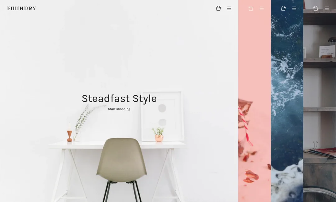
Photography and store design should fit together. The stark, clean photos match this straightforward design, and the header picks up the same color as the image background.
Background: #FFFFFF
Welcome Image Overlay Color: Transparent
Header & Button Background: #F5F5F5
Primary Text Color: #222222, Secondary Text Color: #B5B5B5
Primary & Secondary Text: Karla

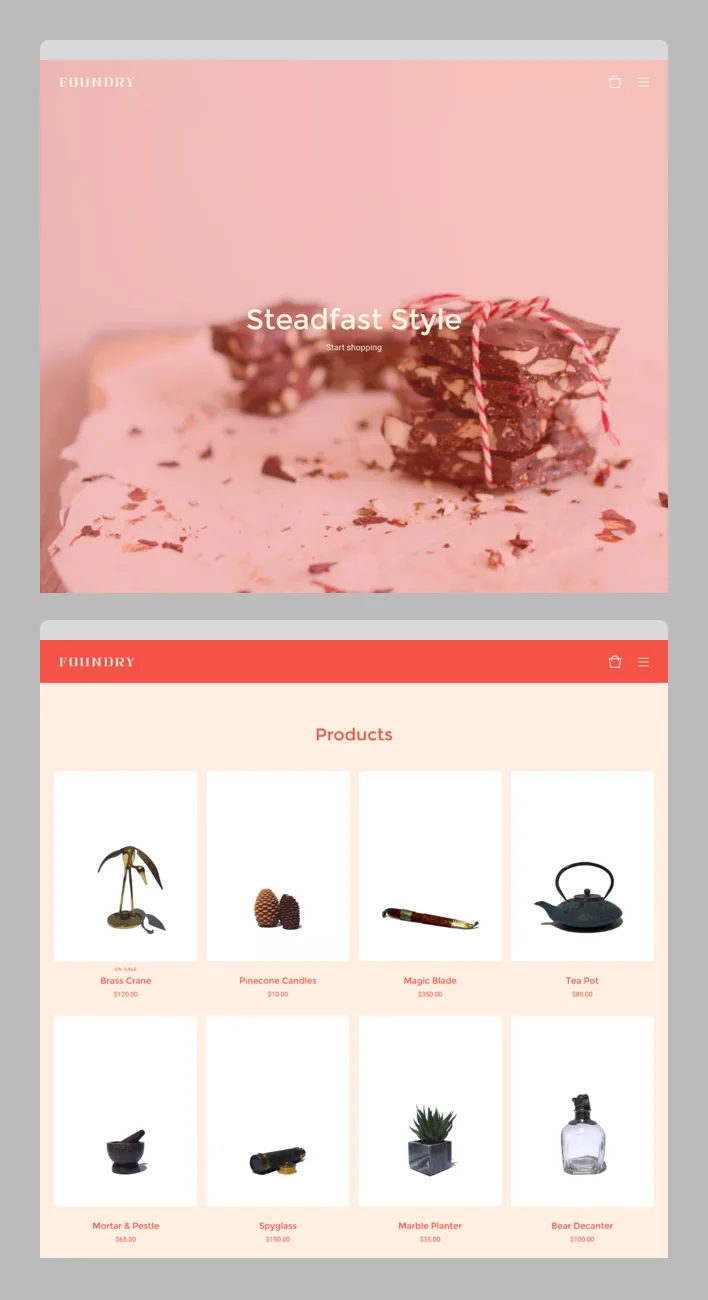
Playful colors can liven up your store, and a strong home overlay background color can instantly change up the look of your welcome image. Think outside the box with your design selections, and don't be afraid to be bold.
Background: #FFEFE3
Welcome Image Overlay Color: #F45345
Header & Button Background: #F45345
Primary & Secondary Text Color: #F45345
Primary Text: Montserrat, Secondary Text: Roboto
Log in to your admin, select your store name in the top right corner, then Customize design. Choose Foundry from the list of themes, and you're ready to customize. You can also read more about Foundry or try out the demonstration store to see how it works.
One more tip! If you're looking for a great image for your own store header, give Unsplash or Death to the Stock Photo a try. Both services provide free, high-resolution images for you to use - we went with some great photos from Unsplash in these examples.
11 July 2016
Words by:Nate Hanson
Tags