Snakebite Styles (Part 1)
- 18 March 2014
- ByDan Christofferson
- 2 min read
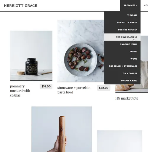
To show off the versatility of our new theme, Snakebite, we worked with Fuzzco to dress some of our favorite shops in this unconventional new theme and came up with a list of styles that’ll give you a head start in working with Snakebite to refresh the look of your storefront.

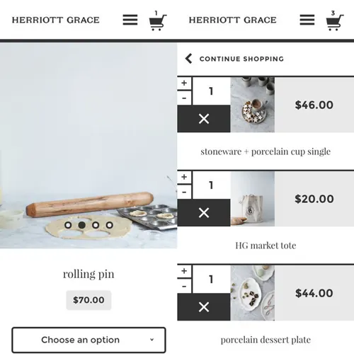
Background Color:
Primary color:
Highlight:
Accent:
Header font:
Text font:
View Badges:
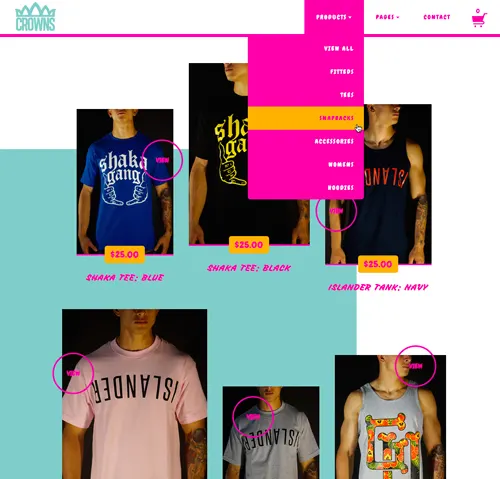
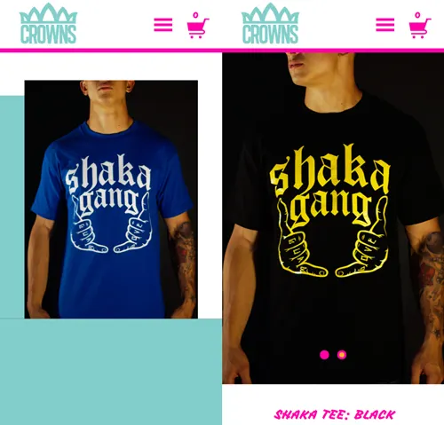
Background Color:
Primary color:
Highlight:
Accent:
Header font:
Text font:
View Badges:
Whether it’s simple sophistication, or the neon colors from your old Trapper Keeper, Snakebite is up for the challenge. Give it a test-drive in your admin now.
18 March 2014
Words by:Dan Christofferson
Tags