Stephen Maurice Graham Illustrates the Value of Persistence
- 9 January 2018
- ByVanessa Wardy
- 10 min read

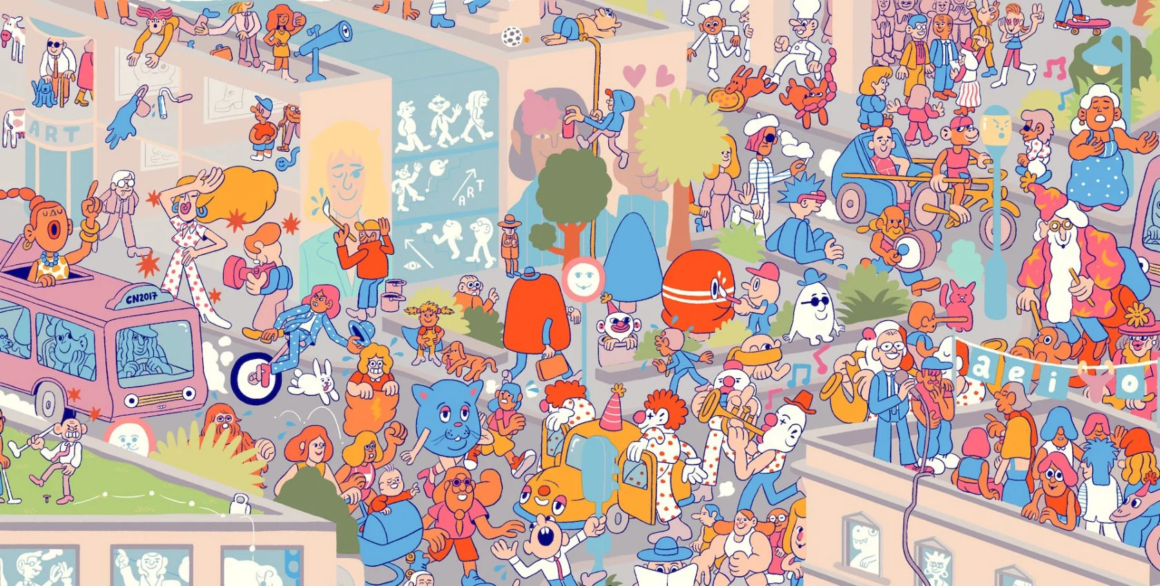
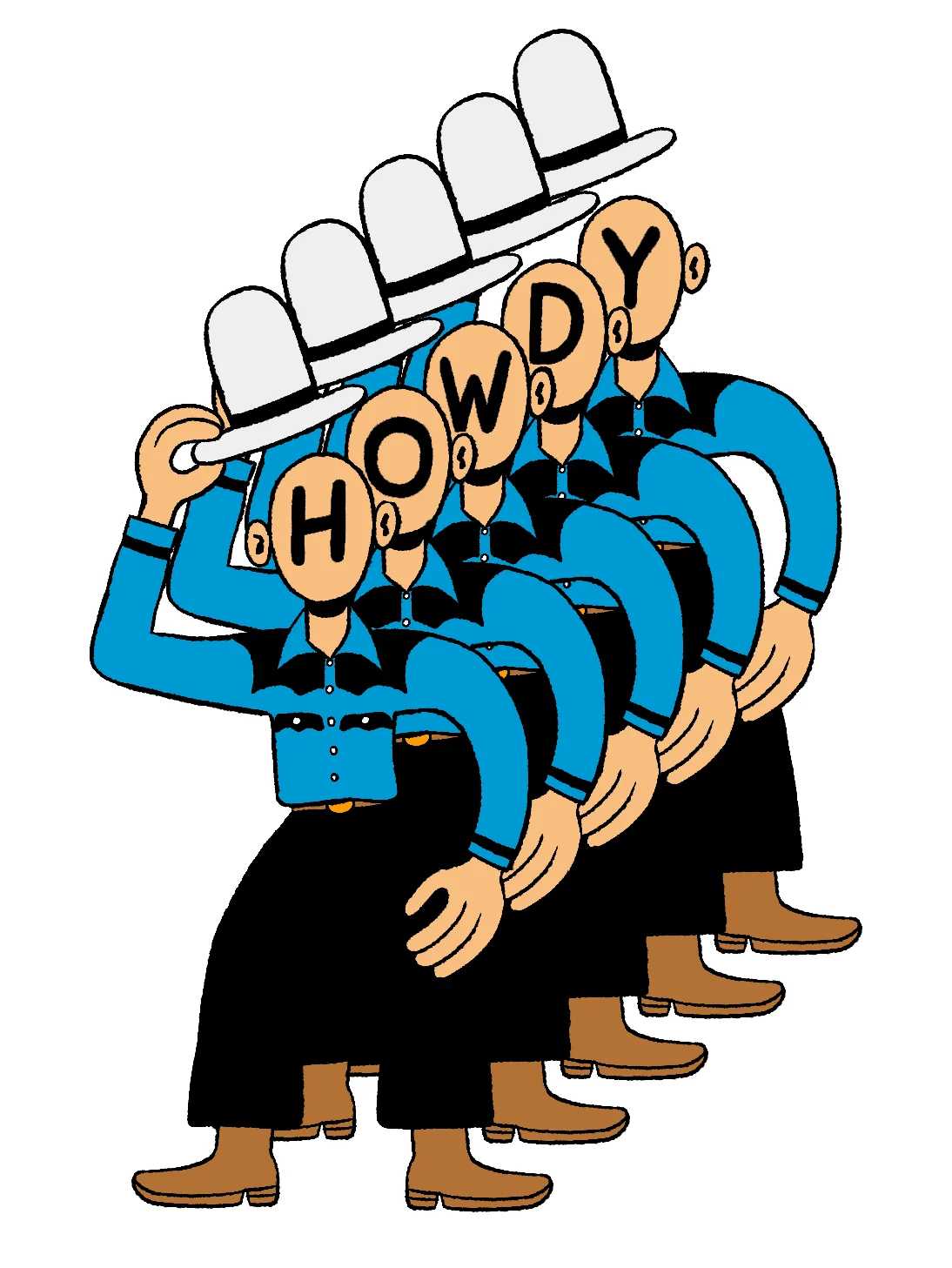
The creations of Stephen Maurice Graham never cease to delight. His work is known for its animated personality, bold linework, attention-grabbing colors, and humorist slant.
Stephen has created illustrations for some big names like Coca-Cola, TIME, and CNN. We're sure that keeps him busy, but he also finds time to make next-level GIFs, a weekly comic for VICE, and he even sells some of his personal pieces through his online shop. Being the fans that we are, we emailed him to learn more about him, his creative process, and everything in between.

I remember drawing video game characters in primary school and being excited when people in class recognized them. I drew Earthworm Jim once for a talent competition, which I had to hold up in front of the entire school at assembly. I remember liking the feeling that I had a thing - I wasn’t any good at sports, or anything else really, so drawing became a focus.
I wasn’t really ever sure if it was something I could do for any length of time. I’m still not sure it’s something that will be sustainable throughout my life. I hope it will be, but I don’t know if tastes will change and one day people will hate what I’m offering!
This kind of second guessing is something that seems to be part and parcel with being an illustrator - you’re always feeling your way forward, hoping that you’re going in the right direction. The same is true of the way I entered into this profession - gradually, tentatively, progressively getting more confident and improving my skills and always trying to build up relationships with clients so they trust me to work on their projects.
In early 2010, I started by making zines and comics before moving onto posters for local bands and blogs. I was doing this for fun in my spare time and didn’t even ask for payment as I wasn’t confident in what I could deliver most of the time. I think back on that time as my “university” years - I didn’t take any courses or do a degree in illustration, I just kept drawing until a style began to emerge, which probably took the better part of three years!
I began to sink more and more time into illustration and even worked on it while I was in my “proper” job, an administrative office job, which led to me being fired for not paying attention. At the time it was a shock, but instead of looking for more office work I decided to take the risk and go full time as an illustrator. I wouldn’t recommend my route, but I guess it lit a fire under me to get good because I didn’t really have anything else to fall back on for work. I don’t know if anything else would make me happy except for drawing.
I begin by trying to think through the idea in my head, seeing how I can skew things around in there, to get a sense of what I want to do before making some loose drawings in my sketchbook. Once I feel like I’m onto something, which can take a while, I make a larger rough with pencil on bristol board. I like the texture and sensation of that paper. I like to get my roughs really close to what the final image will look like (I can be a bit of a perfectionist and I want to know what to expect from the final). Other artists I know will be much looser at this stage and ink in the details later, but I kinda freak out at the idea of the unknown, so I like to make sure I know the route I’m following.
From there I scan and ink digitally on a Wacom screen. I used to use a dip pen with ink, but I prefer working on the Wacom now. It’s cleaner and the brushes you can use add a lot of life and texture. I like replicating the dip pen raggedy lines.

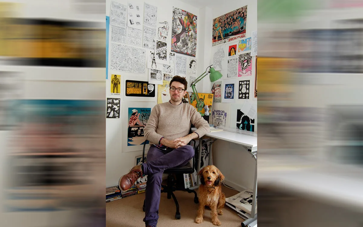
I don’t need much - just a light, the drawing board, and some music. I listen to a lot of YouTube music mixes where I don’t know what I’m listening to half the time. I just checked what was on while I’m writing this and it’s a musician called Lone who I’ve heard before and really like. 😊
You’ve got to be persistent and keep your message relevant to whomever you’re trying to reach. Email art directors with a few images of your work. Make sure to keep it short and polite and targeted. Don’t just send out one blanket email to loads of people at once. It’s tedious, but research who’d be a good fit for you. Approach creative agencies with your work and maybe try and make a few animated gifs to show off your skillset and catch someones eye. I’ll say it again - be persistent.
Everybody feels like they’re not making headway or traction, but keep going. You’re getting better every day that you draw.
I was contacted by Nick Gazin, the art editor at VICE and he got me to do a few illustrations for the site before asking me to do a comic. I came back to him a few weeks later with the first comic and he loved it, so it went weekly after that. I loved working on that run.
Michael was inspired by people in my life and elements of myself - he is shy and introverted and lives an interior life blanketed by technology and suffocating parents. We can all relate to certain aspects of his life, I think. He’s what would happen if we listened to the little voice that tells us to stay in bed, to not move forward in life, to not take responsibility for oneself.
I do, there’s something that I’m hoping will come off and I’ll get to work on in the near future but I can’t say what it is yet. Aside from that, I’m about to come back to VICE with a new run of comics about a guy called Gilbert, a horrible friend of Michael’s who showed up in a few earlier comics.
Gilbert is different - his character is more of a response to seeing how the world has changed in the last two years. When I made Michael back in 2015, the idea of a white nerdy guy who lives in his basement ranting online seemed like quite a benign figure. Sitting here in 2017, I see that figure has consolidated itself into a terrifying league of angry young men flailing out at the world in very shocking ways. Gilbert isn’t cuddly in the way Michael was, he’s narcissistic and angry, believing the world owes him something he hasn’t worked for.
Growing up here has given me the typical sense of humor for this place, in that the response to everything is usually shot through with a sense of cynicism. Not in a dark or grim way, but in a funny, cheery way. I think that’s probably why I’m always trying to be funny. Humor here is a big currency.

I think I’ve already got it. I can’t imagine anything better. I’d like to do more animation and get better at it I guess, but getting to make things the way I want to is the best.
I mean, if pushed I’d like to do exactly the same as what I’m doing right now but to be paid more. Can I have a raise? I have a child to support now and I want to buy Super Mario Odyssey.
I always love everything that Sophia Foster Dimino does. She’s got the most wonderful style to her work that even just her loose line drawings convey so much. A fantastic illustrator and cartoonist you must follow!
To check out more of Stephen's work, give him a follow on Instagram and browse through his shop.
9 January 2018
Words by:Vanessa Wardy