How to Customize Your Shop
- 1 September 2013
- ByBig Cartel
- 5 mins. read

If you're going to take the time and energy to create your own online shop and try to set yourself apart outside of online marketplaces, well, then you'll want to also take the time and energy to give said shop a custom look and feel.
This could mean hiring some folks to make a super fancy store with lots of bells and whistles. Or maybe you just need some simple changes to help your store fit well with your existing brand. We've got a few design thoughts to consider no matter which route you choose.
Get inspired
When designing and marketing your shop, consider a variety of things in your world that catch your eye. Brands, buildings, movies, food, photographs - all of it! Take notes, make an inspiration board, poll all your friends - really try to learn what you like and how it can work into your shop. Do you prefer a minimal appearance? Do you like colors loud and bold? Do you like lots of information, or maybe prefer the less is more approach? Figure out what works for you, then apply everything you glean to your own store.

Make it yours
As much as you want to imitate the design sense of a shop you love, you don't want to be a total rip-off. You want your store to represent you - so make it your own. A plain jane store might not fit your eclectic style, that's cool, you can put a bird on it, just don't put 200 birds on it. Add some touches to your store that help bring across the ethos of your style or mission. Just use some restraint. A clean starting point with a few well placed images or logos goes a long way.
Find a color scheme
Try out color.adobe.com to find the right color combos to fit your style and brand. Try to keep the number of colors in your scheme to about 3, but no more than 5. It's nice to have a highlight color or action color - usually the brightest of the scheme. Then a nice neutral color - something that works for the background or large areas of space that isn't too hard on your eyes or distracting. Then find a complimentary color, something that looks good next to your highlight color that won't compete with it, but looks like it has a crush on it, or something.
Background image
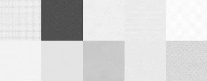
It's easy to go wild with background images and fun colors on your site, especially because you want it to stand out, but simpler may be better. Most professional looking shops are going to have basic but elegant backgrounds, and easy to read fonts and colors, leaving all the attention on the products for sale. If a neutral background doesn't feel right, then a custom background image can help your site stand out and match your brand, just keep things clean, simple and spaced out enough to contrast the busy nature of a large photograph. Toptal's subtle patterns can be a great resource for background options.

Theme selection
Your theme choice really comes down to how you want people to interact with your store. Test out a theme by sitting at your computer and using your site like a customer would. Ask a friend or family member to test out your top two choices, and get their feedback. Find out what feels good and go with it.
Know your limits
Is design not your strong suit? HTML not in your wheelhouse? Don't be afraid to budget in the extra expense for buying a pre-designed theme or custom design work. Spending more money up front to have a quality shop could spare you time and heartache in the long run.
Know your strengths
Do you take excellent photos? Make sure you select a theme to really show off the product images. Got a knack for storytelling? Take a minute to share each product's story within the item description. Talk about the special pieces in your store, and help make shoppers feel invested and attached before they've even finished their purchase.
1 September 2013
Words by:Big Cartel
Tags
- Share