The Evolution of Lunch Break
- 21 April 2016
- ByNick Endle
- 3 mins. read

Nick Endle coordinates and updates all of Big Cartel's themes and integrations. Lunch Break is the first theme he's built on his own, so we asked him to share how it all came together.
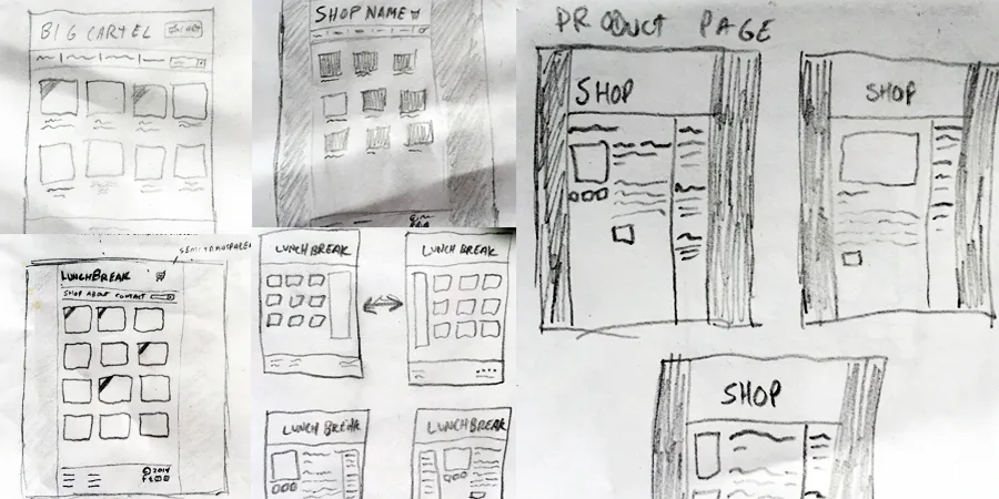
The new Lunch Break theme started out a couple years ago as a way for me to learn more about how Big Cartel themes work. I'd been helping store owners make customizations to their shops for a while, and I figured I could be more helpful if I experienced creating a theme of my own. I started by sketching some rough ideas on scratch paper:

Once I had a few design ideas floating around, I went back and forth with a few names for the theme - nothing really seemed to make sense, but since I was spending time on this project during breaks from work, there wasn’t a more appropriate name than Lunch Break.
It was quite a while before I could decide on the final layout. After going through my sketches and mockups, there was one common element: the main navigation in the sidebar. It reminded me a lot of our Sexy theme, so I took this as an opportunity to come up with a new take on it. I wanted the theme to have a similar feel, but offer more customization options and update it with a fresh responsive design. With that in mind, I created a list of goals:
Responsive to look great on all devices
Simple navigation
Packed with features, without being overwhelming
Works well with any products and branding
Easy for non-programmers to edit the code
I used Dugway to create the theme, a tool we offer that makes the process of building, editing, and testing themes incredibly easy. Since it has the ability to load in any store’s products, categories, and pages, I gained a lot of insight on how the theme would work with a diverse group of stores: apparel companies, jewelry makers, stationery brands, and everything in between. Whether a store had 1 or 100 products, tall or wide product images, chose to display their name in the header instead of a logo - I needed to make sure the theme could handle it all. Dugway really helped with making informed decisions while building.
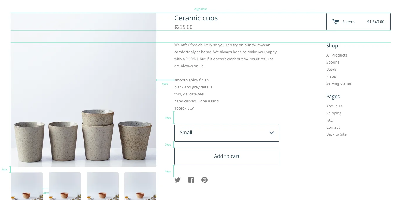
When it came time to wrap things up, I worked with our amazing design team to fine-tune the design - making sure there was consistency when browsing through pages in the store, the color settings made sense, and the spacing surrounding elements on the page felt right.

Although Lunch Break has only been available to use for a few weeks, we’ve seen quite a few stores customize the theme and really make it their own. Head over to our Test Drive Lunch Break store to see it in action, or select the theme in your admin now.
21 April 2016
Words by:Nick Endle
Tags
- Share